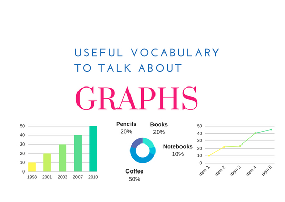
One of the most important parts of any business presentation is charts. Charts and graphs describe the way the business is doing and summarise any research made by you and your team. We have decided to compile a list of words used to describe charts in order to help you be as accurate as possible!
Most common types of graphs
Line Graph

Pie Chart

Bar Chart

Verbs you can use to describe trends
| Upwards trend (rising line) | Downwards trend (falling line) | No change | Frequent change | The highest point | The lowest point |
Rise Increase Grow Go up Improve Jump Surge Shoot up Soar Rocket Recover, stage a recovery Expand | Fall Decrease Drop Decline Go down Slump Plummet Reduce | Remain constant Remain stable Stay at the same level Stabilise Level out Plateau | Fluctuate | Peaks Reaches its highest point Reaches a peak | Bottoms out Reaches a low Hits a low Reaches its lowest point Hits its lowest point |
Some examples:
- Amazon’s quarterly profits soar past $2bn for the first time.
- Car sales in Europe surged in H2 on strong SUV demand.
- The profits leveled out and then plummeted to a net loss the following year.
- Analysts believe that the stock market has finally bottomed out.
Adverbs and intensifiers you can use when describing a trend
- slightly
- a little
- a lot
- sharply
- suddenly
- steeply
- gradually
- gently
- steadily
Some examples:
- If a business is barely generating enough revenue to cover its expenses and those expenses rise suddenly/sharply, the business is in a great deal of trouble.
- German steel inventories are expected to decrease slightly / a little in the next quarter.
- Food prices around the world have been rising gradually/steadily since late 2014.
Did you know…
… that the word “figure” can mean both “a chart or diagram” and “a number”?
Figure 2 on the next page shows our sales figures for this year.
Go figure!
